
Our Family Template Rose


The Our Family Template (Rose) is is based on one of the templates offered on Expression Web Mobile Friendly Site Templates. This template uses a liquid width with a maximum declared width of 1500px. The header image must be inserted into the html code rather than the css in order to resize to fit mobile devices. This site layout passes the Google mobile-friendly site test.
Package Includes
This template package includes:
- A complete DWT Site Template package which requires FrontPage 2003, any versions of Expression Web or Sharepoint Designer.
- A blank template that can be used with any web editor.
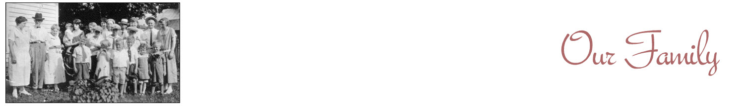
Images
Background Image: Banker's Granite from Eos Developers. Classes are included as part of the style sheet to float your images right or left or center them on the page. There is also a class to scale the images so the fit the screen size of various mobile devices. Masthead image is 1500px x 215px and is a sample only. You will need to create your own graphic image to use in the header.
Changing the Column Background Color
A background image is used to create the equal height column look. If you wish to change the color of the columns, you will need to create a new image.
Search Box/Contact
Both the Search Box and Contact page are samples only and do not work. You can use any search engine you choose. The styling for the search areas is part of the external style sheet. See the contact page for more details.
Menu
This template uses a single level top and side menu. The top menu use the instuctions provided by W3schools for Responsive Top Navigation. If you would like a multi-level drop down top menu, please see Responsive Navbar with Dropdown
Additional Resources
You can find detailed instructions for working with the mobile friendly site templates as well as a pdf file you can download and print.
General Information
The masthead, top or left navigation as well as the footer can be easily converted to SSI's by following the server side include tutorial OR to a FrontPage or Expression Web include. The blank template does NOT require any special web editor to use it. It should work with any of them - even a plain text editor. Remember, if you are located in another country to change the language statement. You are welcome to use the template for any of your projects, however, the link back to my site MUST remain. ENJOY!