


Roots & Branches Template


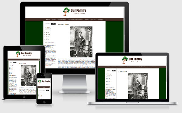
The Roots and Branches template is based on one of the templates offered on our sister site - Expression Web Mobile Friendly Site Templates. This template uses a fixed width layout and is mobile friendly.
Package Includes
This template package includes:
- A complete DWT Site Template package which requires FrontPage 2003, any versions of Expression Web or Sharepoint Designer.
- A blank template that can be used with any web editor.
Images
The leaf images used as the bullets are from Icons etc (no longer in existence) and have been resized much smaller. Classes are included as part of the style sheet to float your images right or left or center them on the page. If you want your images to resize to display in all devices, you will need to apply the class scalable to them.
Fonts
This templates makes use of one of the Google web fonts, Federo. Read more about Google web fonts.
Changing the Column Background Color
A background image is used to create the equal height column look. If you wish to change the color of the columns, you will need to create a new image.
Search Box/Page
The Google Custom search box will need to be adjusted with the code for YOUR custom search. You can, of course, use any search engine you choose. The styling for the search areas is part of the external style sheet.
Menus
The top menu is from CSSMenuMaker. Unfortunately the site is no longer being kept up but the source files are available for many of the menus. This one allows for two levels of sub menus. Be careful editing your menu. The multi-level menu is a sample only and does not have pages linked. The side menu can serve as sectional navigation or can be removed.
Additional Resources
You can find detailed instructions for working with the mobile friendly site templates as well as a pdf file you can download and print.
General Information
The masthead, top or left navigation as well as the footer can be easily converted to SSI's by following the server side include tutorial OR to a FrontPage or Expression Web include. The blank template does NOT require any special web editor to use it. It should work with any of them - even a plain text editor. Remember, if you are located in another country to change the language statement. You are welcome to use the template for any of your projects, however, the link back to my site MUST remain. ENJOY!