April Daisies Template

The April Daisies Template is an updated version of the the original April Daisies Template and is based on one of the templates available from our sister site Expression Web Mobile Friendly Site Templates. While both the CSS and HTML code is heavily commented, this template is for the more advanced user.
This template uses some CSS3 for the rounded corners. The rounded corners will display as intended in newer modern browsers but will degrade gracefully in older browsers and default to rectangular corners.
This template also makes use of Google Web fonts. The font used for the Site Name and menus is Gabriela. Normally if you use a "fancy font" as part of your site, your viewer will need to have that particular font available on their own computer to view it as YOU intended. Read more about using Google web fonts.
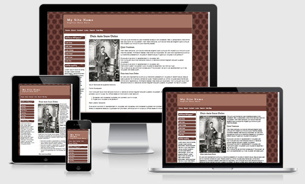
The April Daisies template uses a fluid layout with the container is sized to be 80% of the viewer's window but will not exceed 1500 pixels as the maximum width. This can be changed by editing the style sheet #outerWrapper style rules. You can read more about CSS minimum and maximum sizes.
Images
The page background image is April Daisies from Eos Developers. This particular graphic is no longer available. If you use the background, the credit link MUST remain. There are many background images available on their site in many different colors.
Classes have been created to float the images within the content area to the left or right or centered on the page. ALL images should have an alt attribute for accessibility reasons. Images will scale to fit the browser viewport.
Changing the Column Background Colors
The equal height column look is achieved by using a background image on the contentWrapper. If you wish to change the color scheme, make sure you create a new image to use for the background.
CSS and Script Links
Besides the main style sheet (site.css), there is a special style sheet (media-queries) which allows the inclusion of special CSS rules to optimize your page for mobile browsers.
Additional Resources
You can find detailed instructions for working with the mobile friendly site templates as well as a pdf file you can download and print.
Also resources on both drop shadows and rounded corners.
Template Package Contents
This template package includes:
- Dynamic Web Template that can be used with Expression Web, FrontPage 2003, or SharePoint Designer 2007. DWT is attached to all site pages.
- Blank Template that can be used with any web editor.
- all support files including images, style sheets, javascript file.